- News |
-
- Featured
-
Canada’s privacy commissioner launches investigation over the use..
As the years pass by, technology also widens, and more and more are being discovered. From simple gadgets..
- Business |
-
- Featured
-
Be an informer to I-T dept; earn up..
Sharing "specific information" with the income tax department about any benami..
- Tech & Industry |
-
- Featured
-
Gravitational wave event likely signaled birth of black..
The merger of two neutron stars that generated gravitational waves detected last year may have led to the birth..

- Entertainment |
-
- Topics
- Malayalam Film
- Media
- Music
- Youth
-
- Featured
-
Shawn Mendes Released Highly Anticipated Self-Titled Album Today
Los Angeles, CA : Multi-Platinum singer/songwriter Shawn Mendes released his highly anticipated self-titled third album today, via Island Records. Get..

-
- New Products |
-
- Topics
- General
-
- Featured
-
ZOTAC Introduces Its GeForce GTX 960 series graphics..
Dubai- ZOTAC International, a leading innovator and manufacturer of graphic cards and mini-

-
- Education |
-
- Topics
- Campus News
-
- Featured
-
ITM University, Gurgaon Student Palash Chhabra Represents Varsity..
New Delhi: Palash Chhabra, a student of ITM University,..

-
- Health |
-
- Topics
- Medical News
-
- Featured
-
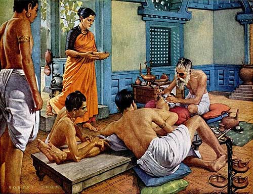
Maharshi Shushruta, The Great Grandfather of Surgery!
by Ayurvedacharya Dr.Hitesh Jani Dr.Hitesh Jani
-
- Tourism |
-
- Topics
- Travel
- Food&Beverages
- Hospitality
-
- Featured
-
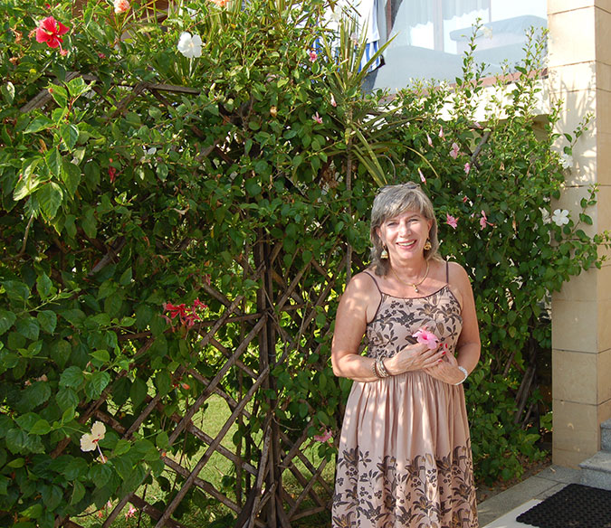
“Keraliya Ayurveda is Credible and Authentic”
Irina Gurjeva Irina Gurjeva is not just another vacationer in..
-
- Sports |
- Editor's column |
- Magazine |
Horlicks – GSKCH’s Mega Brand Transforms from a Health Food Drink to a wholesome Food & Beverage Brand
Published on October 27, 2010
New Delhi:GlaxoSmithKline Consumer Healthcare unveiled its Mega Brand Horlicks in its new avatar. Horlicks, the mainstay for GSK Consumer  Healthcare has over the years evolved to become a 1500+ crore Mega Brand with products under various categories like Biscuits, Nutribars and the most recent one being instant noodles, thereby completing its transition from a Health Food Drink major to a range of food & beverage brand, focusing on the health and wellness category.
Commenting on the transformation, Mr. Zubair Ahmed, MD, GSKCH said, “We are very excited with the opportunities in the health and wellness category prevalent in India today. It has been a natural progression for Horlicks from an HFD towards a food and beverage brand with its plethora of offerings, thereby cementing its place as a Mega Brand”.
“Horlicks has seen unprecedented growth in the last 3-4 years. With a 52% share in the HFD category, this move will further strengthen the equity that the brand enjoys amongst consumers,” added Mr. Ahmed.
As it prepares to enter the new decade, the immensely popular flagship brand of the company, Horlicks has undergone changes in look and feel in keeping with the changing times but still maintaining the core values for which the brand stands for across the years.
As India makes its historic journey to become a superpower, there are immense numbers of opportunities available for all Indians; the value proposition of brand Horlicks is aimed at providing the family with a healthy choice so as to be in ‘top form’ of health & be ready to grab these opportunities. “The new look and feel has been arrived at after a lot of consumer research and the inspiration has been taken from within the brand itself. The Wave on the packaging symbolizes Activity and ‘Sfoorti’ and the Milk and Wheat visual establish Horlicks as the Great Family Nourisher. The Blue and Orange colour have been a part of the Horlicks brand over the last many years- Blue signifies the Dynamism/ Sfoorti and Orange signifies the association of the brand as the nourisher of the family. The logo of the Horlicks Nutrition Academy reinforces the brand’s trust and equity in the consumers’ minds and also the fact that Horlicks has been backed by science and endorsed by experts” commented Mr. Shubhajit Sen, Executive Vice President-Marketing, GSKCH.
As part of the revamp, the brand is also investing in an extensive mass media campaign across TV, Print and mobile marketing. A nationwide activation campaign will also be announced this month as part of which, consumers will have to call & answer three simple questions on health, record their ‘mauka’ and they stand a chance to get their opportunity/mauka funded through Horlicks.
Driven by its mission to improve the quality of human life by enabling people to do more, feel better and live longer, GSKCH India is looking at bridging all gaps in the health and nutrition needs of the Indian consumer by growing organically and building the brand from strength to strength.